


Search results: mobile-friendly will count for more
This article is 10 years old — prices and terms may have changed.
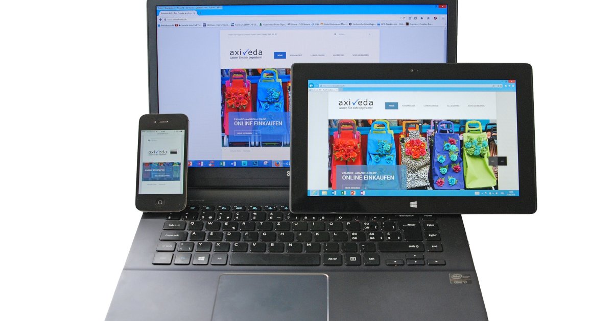
More and more often we go online from phones, tablets and other mobile devices — it is fast and convenient, and the arrival of 3G and 4G has helped a great deal. There is no longer any need to wait until you reach the office, a café or home to look something up, make a purchase or check social media.
Facebook's mobile audience, for instance, already stands at almost 1 billion people, which speaks for itself.
Conversely, we feel irritation less and less often at finding that the site we need is not adapted for mobile devices and the whole layout has gone askew. But if a site's pages display properly, the typeface is comfortable and legible, and placing an order or paying is no trouble, the site gains one more satisfied user in us.
Meanwhile search engines are trying to adapt to mobile devices too, and site owners are in for changes — and perhaps even some trouble.
Google has announced that on 21 April it will launch its updated mobile-friendly algorithm. Resources with mobile versions will rise in mobile search results and in ranking, while sites that are not adapted will fall accordingly.
If you have a site and are not sure it is well adapted to different screen sizes, Google will let you know.
Open your site from a phone, for instance, and if the site does not meet the requirements you will see a hyperlink leading to a page about site optimisation. And if that link does not appear, your site displays correctly on screens of different sizes.
You do not have to wait — you can check in advance how friendly your site is to mobile users with this tool https://www.google.com/webmasters/tools/mobile-friendly/.
But what if the link did appear? Then the site has to be adapted to different devices.
There are three ways of solving that problem.
1. Responsive design — a way of designing a web page so that the site can be viewed comfortably on laptops, phones, tablets and any other device, because it adjusts to any screen size.
That is the most popular option today. The URL is the same for every version intended for different devices, which is convenient — there is no need to set up redirects. And you only have to work on one version of the site rather than several. On the other hand the site may load more slowly on mobile devices.
2. A mobile version — means moving the site's pages to a different URL (www.site.com/mobile/page, for instance) or to a subdomain (m.site.com/page) aimed at mobile devices and screen sizes.
A mobile version is good because it is simpler than the desktop version and loads faster. And you can switch to the PC version at any moment. But there is a minus: users have to remember several addresses for the site.
3. Dynamic serving — a complex method of adaptation that serves the same URL but different HTML for different devices.
The positive side is that you can use different layouts for different devices on different operating systems (Android, iOS) or for different screen sizes (tablets, PCs, phones).
The inconvenience of the method is that the server cannot always correctly determine the device the request comes from and may serve a version for the wrong screen size.
Every method has its pros and cons, and here the site's owner should go by their own preferences and means.
And we hope you adapt your projects to the new algorithm in time and get through 21 April calmly. Good luck!