


The top 12 web design trends of 2021
This article is 5 years old — prices and terms may have changed.
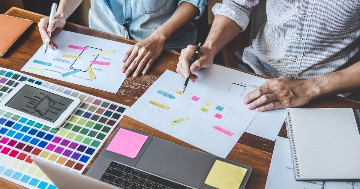
Several months of 2021 have passed and many trends in web development and design have become clearer. We can now talk about them more specifically.
Why does a site's design matter so much?
Every site owner wants to present their services brightly and creatively, to stand out among dozens of competitors.
A few years ago Adobe surveyed 2000 consumers and found that:
- 73% of respondents prefer content that "displays well on the device".
- 66% of respondents prefer beautifully presented content to plain and straightforward content.
These figures show how important good design is to promoting a business successfully. An attractive website is the key to attracting new visitors and keeping existing customers. So if you are looking for ways to improve your website's design, read on for the main web design trends of 2021.
The 12 main web design trends of 2021
Here are 12 web design trends that will help you make 2021 brighter.
Bold colours

Bright colours in a site's design are there to lift visitors' mood
2021 is the year when bold, bright, saturated colours find their way into your web design.
A bold, bright colour stands out against the background and fills with energy. Be inventive and combine colours properly to strengthen your message and lift the mood of the site's visitors.
Colour shades that will help add emotion to your design:
- lime green — refreshing and balancing;
- fiery red — shows strong emotion, enthusiasm and energy;
- yellow — bold and positive;
- black — classic, and goes well with most colours;
- blue and turquoise — health, calm;
- orange — emphasises the out of the ordinary.
Another popular trend is vintage-style colours. Taking inspiration from magazines and television, designers mix vintage colours with modern shades to give a site a nostalgic touch. Sites such as Charles the Bold and Banger'sare examples.
The key: choose the right main colour for the brand and build the colour scheme on it. Stick to it throughout the site.
Gentle animation
Animated elements are growing in popularity in web design. They work incredibly well, particularly when information on a page has to be presented simply and attractively.
So do not be afraid to step outside the lines and add some fun and liveliness to your web page this year by adding animated visual effects.
What should animation in web design be used for?
- To highlight a feature or important information — icons, photographs, a call to action or a product's price;
- to highlight hidden or drop-down menus;
- to add hover effects for micro-interactions, in a gallery's elements for instance;
- to make a banner image unconventional.
Some examples of cool, surprising animation can be found on these sites:
Neomorphism

The designed object looks like the real thing — that is neomorphism
Neomorphism is a new phenomenon in the world of user interface design. This design trend is an evolution of skeuomorphism, which involves integrating real objects into interface design. Put simply, it means you design a familiar object so that it looks exactly like the real one. The calculator interface on your computer, for example.
Neomorphism also determines the colour palette of the whole screen, which, when used in a design, delivers an entirely unique experience for users. You can create a design with elements of neomorphism. For that:
- use highlights and shadows to give the design depth;
- use solid and gradient backgrounds;
- choose soft, subtle effects.
Use larger images

Use large images for a site's background — it looks cool and modern
Let us think bigger in 2021. Use large images on the home page. Photographs and graphics with text over them help you make a statement and catch visitors' attention.
That suggestion may sound too loud, but used properly such a solution will make your web design striking. Many websites use highly detailed graphics to state the company's motto. When visitors see an image, it matters that it is attractive: that keeps them on the site, exploring the options and reading further.
When choosing an image for your website, think first of all about your brand's goals. Find graphics or a photo that will work towards those goals, improve the image and show it. Remember that you do not have to use an image across the whole background — you can simply use it in the header and still look expensive.
White space is in fashion now

The Popsters service uses plenty of free space in its site's design skilfully
Plenty of free white space has been on the list of web design trends for the past few years. Empty space on a website is the distance between the large design elements.
The main purpose of those white bands is to give visitors a balanced feeling and make navigating and reading the content easier for them.
Use white space in moderation. It matters to keep a balance between empty space and content, because if it is done wrongly every design element and any text on it will seem cut off from the rest. That makes the page harder to scan and scatters visitors' attention.
Variable fonts

Interesting (and readable) fonts are an important matter for site design in 2021
One of the web design trends of 2021 is variable fonts. Web designers can choose several variants while staying within one typeface. You can expand, condense, add space and change the width of a font to find the best solution.
That helps control the technical parameters and reduce page loading time. The space for creativity in typography grows as a result: designers can create energetic, dynamic forms in ways that were previously impossible technically.
Using geometric patterns and three-dimensional graphics

Ondo uses bright colours and geometric patterns at the same time
A website with few design elements, or none, is perceived as a wall of content. The page may hold all the necessary information, but without design the conversion rate is lower.
Modern designers use geometric patterns and three-dimensional elements to add uniqueness to their sites. This category includes a variety of flat shapes:
- rhombuses,
- triangles,
- rectangles,
- polygons,
- lines,
- grids and so on.
Volumetric shapes are used as well: floating objects and 3D elements.
Sliders have gone out of fashion
Image sliders look dated now and, worse, they slow your site down and are less compatible with smartphones.
What is in fashion, then? Video in the page header.
Use a single image or video to show users the main message in one picture, rather than breaking it up. Using video in headers has turned out to be the most attractive form of online content, so it is no surprise that the old sliders are losing their grip in the coming web design trends. The design of the Altermind
Ensure the site loads fast and stays stable
According to a web usability study, most visitors (42%) will leave a website if loading takes more than 10 seconds.
A website's functionality remains an important aspect of web design. When building one, take care of its loading speed, the page's responsiveness and its availability.
A dark theme for sites

Look at how Apple used a dark theme on its website
For some time web designers kept using white backgrounds to create free space on websites and in mobile applications. The dark theme soon became popular and won wide acceptance.
We are sure the trend holds for 2021 as well.
Minimalist design

Google itself has long used the principle of minimalism
People are tired of being overloaded with information, and that applies to site design too. Minimalism goes excellently with a small amount of animation and soft shadows.
Minimalism means presenting a product with a few simple design elements, emphasising its particulars and its competitive advantages.
Complement minimalism with clean colours

The New York Times site is an example of such design
A new trend emerged in 2021: colour should provide contrast between the background and the images. A white background remains current, and it can be diluted with colour accents at the points where the visitor's attention needs directing.
Summary
Modern design is developing towards placing colour and semantic accents correctly. Contrast, and colour and semantic accents, are given growing weight as well.
Sliders on sites went out of fashion long ago.
Minimalism, contrast and colour accents matter more and more in design.